From noise
to action
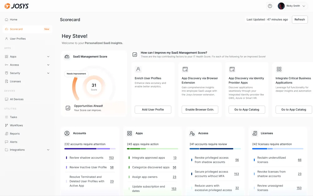
Redesigning Josys's SaaS management dashboard from a generic data readout into a security-first, action-oriented command center that helps IT admins reclaim control of their stack.
Role
Lead Designer
Team
Design Director · PM · Data
Scope
Discovery → Handoff
Platform
Web · IT admin
01, Context
What is Josys, and who uses it?
Josys is a SaaS management platform that gives IT teams full visibility and control over the software and devices their employees use.
The core users are IT admins and security leads at mid-market companies, people working across dozens of tools, managing hundreds of apps and thousands of user accounts, under constant pressure to reduce cost, stay compliant, and close security gaps. I led design on the Scorecard and Dashboard experience end-to-end alongside the Design Director, from discovery and strategy through execution and engineering handoff.
02, The problem
A dashboard full of data,
empty of direction.
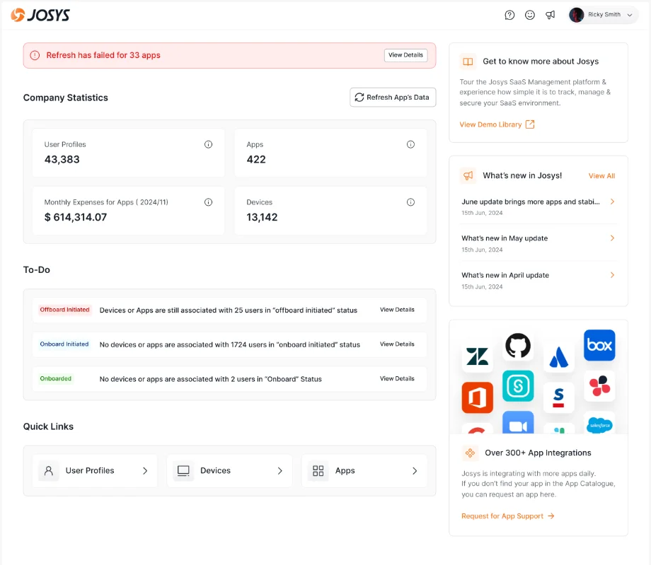
The old dashboard opened with four generic stat cards, a spending line chart, and a most-used-apps table. On paper it covered the basics. In practice it told admins what was happening, never what to do about it.
Every session ended with the same question:
“Okay… so what do I act on first?”
Core tension
The dashboard was built around metrics. But IT admins don't manage metrics, they manage risk. The product had to shift from "here is your data" to "here is what needs your attention, and here's how to fix it."
What we found
Admins checked the dashboard every morning but couldn't determine a clear first action. The spend chart didn't connect to any task they could complete in-product.
Sales had nothing to anchor demos. Every feature needed a guided walkthrough, no single number or visual carried the value proposition.
Unauthorized apps and accounts were admins' top concern, yet nothing on the dashboard surfaced that urgency.
Security and compliance issues were spread across sections, admins navigated five different pages to get one full risk picture.
02, Research
Who we talked to
The US support & CS team lived on the front line and heard the same frustrations weekly. The Japan support team brought a more security-sensitive, compliance-heavy enterprise context. The sales team knew exactly what blocked deals. I paired all of it with session recordings and drop-off analysis.
“I look at the dashboard, nod at the numbers, then go to Slack to figure out what's actually on fire today. The two don't talk to each other.”
“I know we're overspending on SaaS, but I can't prove it without spending hours pulling data.”
“The scorecard idea sounds great. I just want a number I can show my CTO every month.”
Key insight
Admins open Josys
in two modes.
“What is broken right now?”
“What should I work on this week?”
Reframe
The old dashboard served neither, it was permanently stuck in an ambiguous "here's some information" state. We designed for triage first: if an admin could leave a 60-second session knowing exactly what to fix, the product would feel indispensable. A single score creates urgency, improvement pathways create motivation, and specific breakdowns create clarity.
Iteration 01
Making it actionable
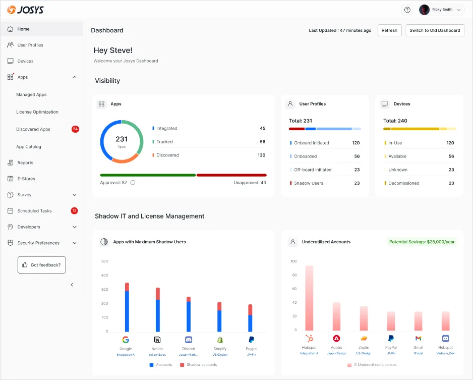
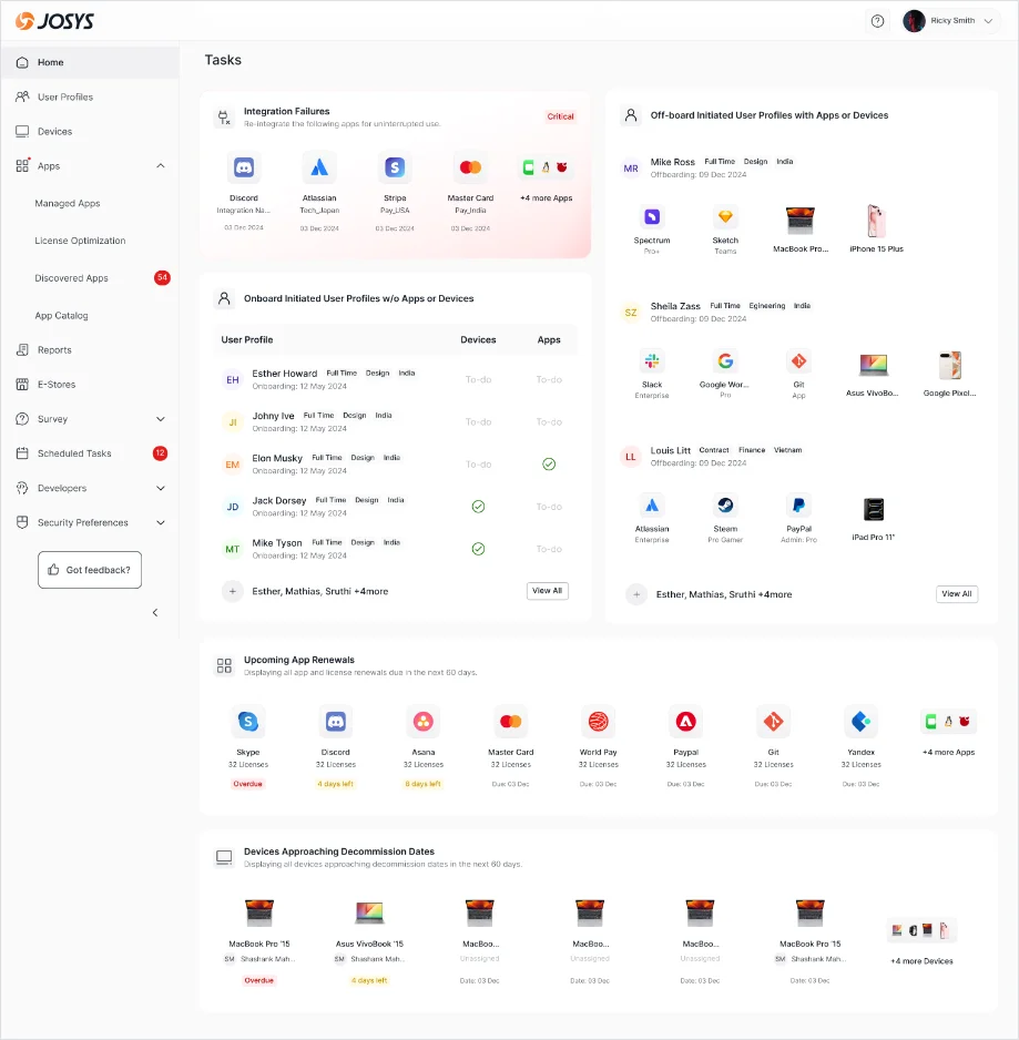
I gave admins a bird's-eye view of Apps, User Profiles and Devices, then surfaced the two biggest cost drivers, apps with the most shadow users and underutilized accounts, with potential savings called out ($28,000/yr in one org). Most importantly, the wall of numbers became a concrete to-do list.
What phase 1 taught us
Tasks told admins what to do, but not why it mattered or how urgent it was relative to everything else. Someone with 40 integration failures, 56 shadow users and 12 upcoming renewals still couldn't answer: "Is my SaaS stack in a good or bad state overall?" There was no north star.
Iteration 02, the bet
Introducing
the Scorecard
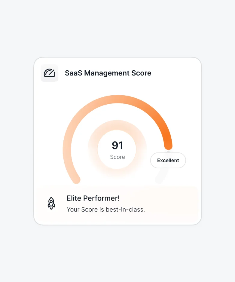
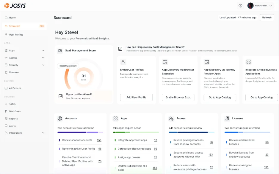
The central bet of the redesign: a SaaS Management Score, a single composite number (0–100) that didn't exist anywhere in the original product. To work, it needed two things: enough data points to be meaningful, and the reasoning behind the number so admins could trust it and act on it.
One number, five states
Poor
Needs work
On track
Very good
Elite
Why the anchor matters
Admins can now report a single number upward: "Our SaaS health score is 31, here's why, and here's the plan." The score turns a pile of widgets into a shared goal, and tracks improvement over time so progress is visible.
Proactive recommendations
A scrollable carousel of contextual, prioritized alerts generated by the system, turning the score into next steps.
20% increase in Adobe CC spend vs last month.
Review now →8 apps inactive for 60 days, consider deprovisioning.
Review now →3 accounts with excessive admin access in Salesforce.
Review now →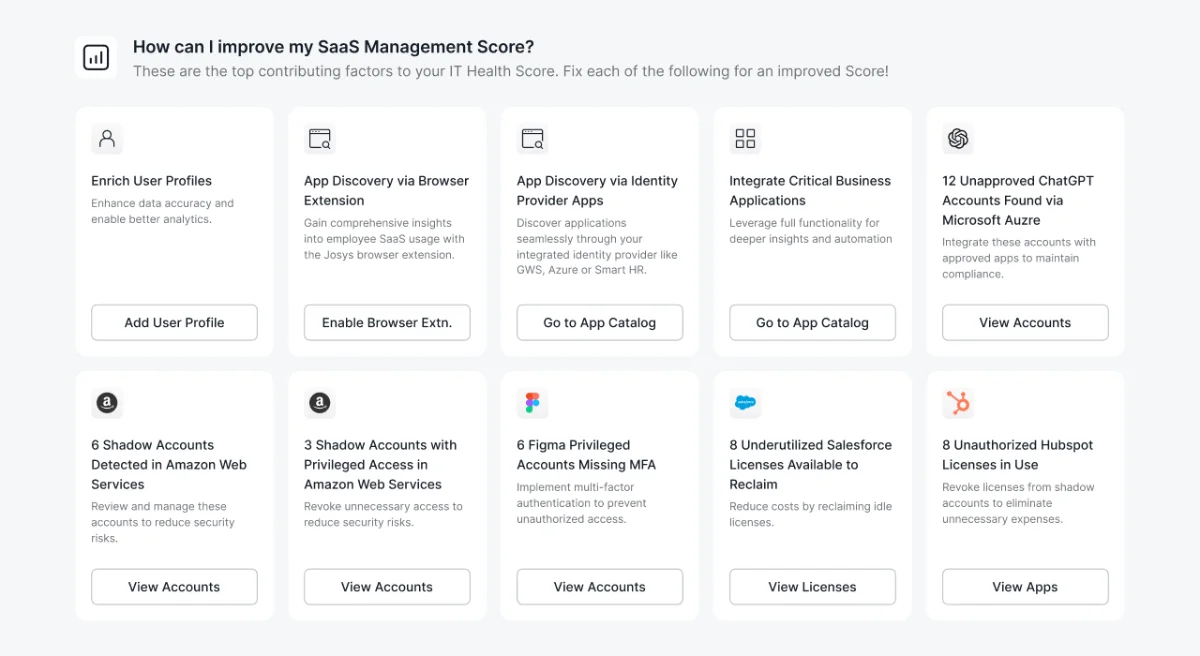
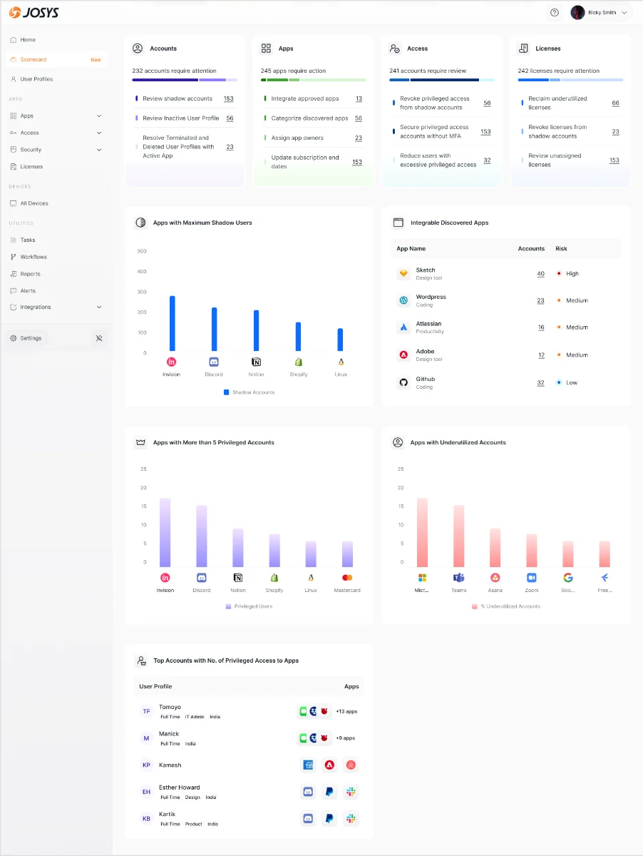
Four pillars of the org
that need attention
that require action
to review
to reclaim
Grouped under two lenses, Cost Intelligence (shadow users and underutilized accounts are the most common source of license overspend) and Security (reviewing the apps and accounts with the most privileges).
Prototype
See it in motion
A walkthrough of the Scorecard experience, from landing on your score to acting on the top contributing factors.
Impact
What we moved
Health Score engagement in the first 30 days post-launch
From login to first completed action
Most-demonstrated feature in new sales cycles
“Finally, one place where I can see what's actually wrong with our setup. Before, I had to look in five different places.”
“The suggestions panel alone saved us from renewing three apps we weren't using. That's real money.”
Qualitatively, onboarding got dramatically faster once the Scorecard became the landing page, new admins understood the product's value without a walkthrough, and the score created a shared language between IT and their managers.
What I'd do differently 🤔
We designed the scoring algorithm with the PM and data team but didn't validate the weighting with real admins until late, some felt security was under-weighted. An earlier co-creation session would have saved a revision cycle.
We had strong intuition but limited behavioral data. Standing up proper analytics before Phase 1 would have given a cleaner before/after comparison.
Admins at larger orgs wanted to filter to only critical alerts, High / Medium / Low. A severity filter on the triage strip was a clear next step.
If an admin dismisses a suggestion, we lose that signal. A lightweight "Already handled / Not relevant / Remind me later" would improve recommendation quality over time.