LocoDesign
System 3.0
The ultimate design system for a fleet manager, taming a product that scaled to 1M+ vehicles faster than it could stay consistent. (For context: the old component library lived in Photoshop. 😂)
Role
Research · UI · Docs
Team
Cross-functional
Platforms
Web · Android · iOS
Method
Atomic Design
01, Overview
Grew fast.
Grew messy.
LocoNav launched in 2015 and became India's #1 fleet-management solution, with 1M+ vehicles managed across web and mobile. But rapid growth was unstructured in terms of product design, no design system, which led to severe UX inconsistency across platforms. As the team expanded in September 2021, keeping track of every component became impossible.
02, Why a design system?
Ship faster,
ship consistent
Unstructured growth left UX inconsistency across every platform.
A startup solving new problems constantly, a system lets you build product faster.
A fast-expanding team made it hard to track all the components.
💡 For context, the LocoNav component library was in Photoshop (before me). 😂
My responsibilities
Part of a cross-functional squad
We had weekly syncs to steer the initiative. My duties spanned four areas:
Research, 01 · Visual analysis
We audited our own product
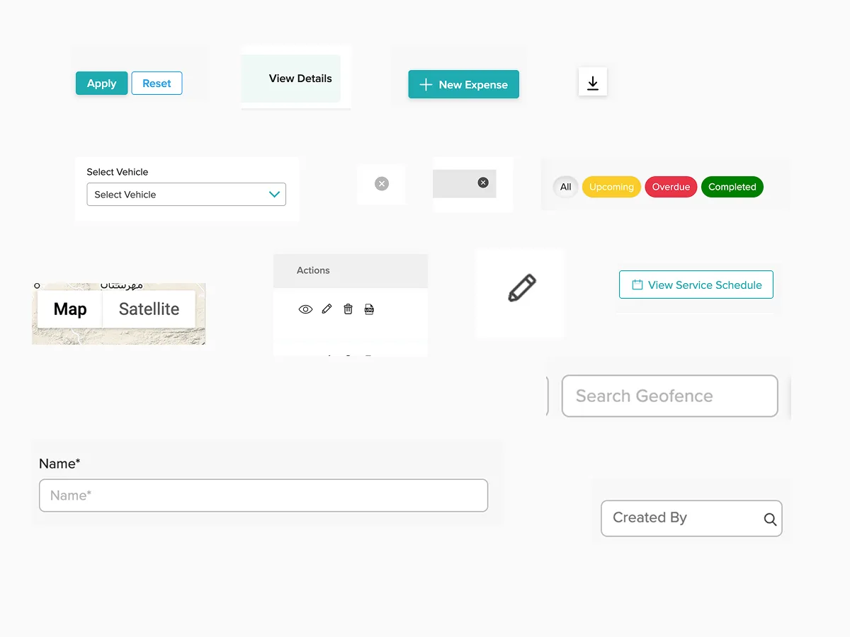
Across every screen size and live module, we listed every instance of each component, buttons, dropdowns, input fields, on all pages and flows, then interviewed front-end developers and designers about their goals and pain points.
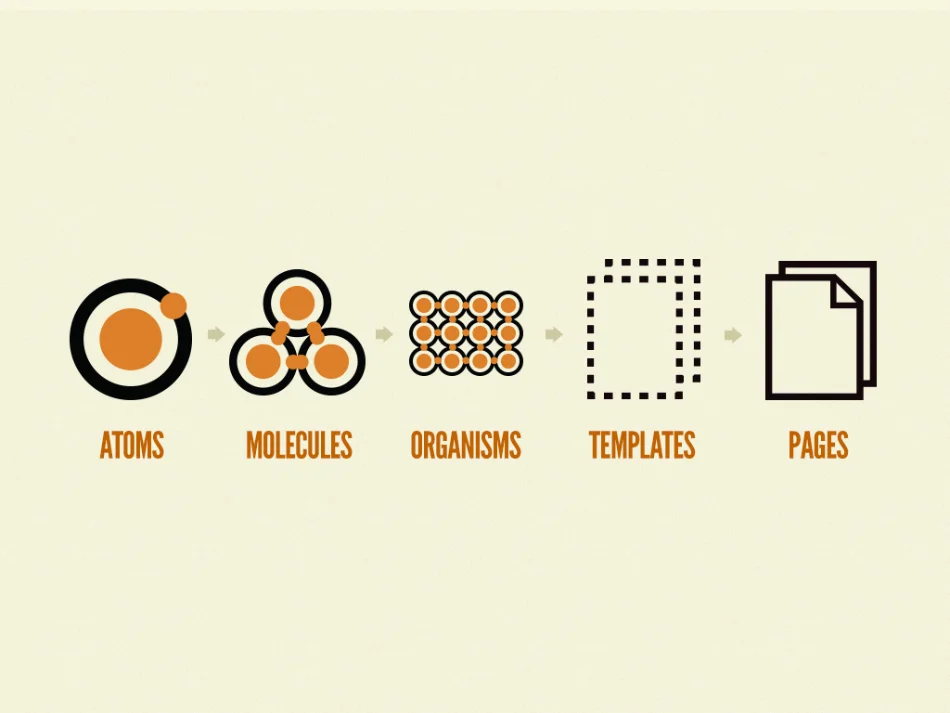
We worked in reverse, starting from the widest pages and tiering down: Templates → Molecules → Atoms.
Key findings
Three things were hurting us
Colors, components, guidelines, all over the place, hurting both the experience and the brand image.
No component library meant repetitive design work, and developers rebuilding the same components again and again.
No button hierarchy and no clear structure for the different component states across platforms.
Research, 02 · Benchmark
Learning from the best
We deeply analysed the documentation, guidelines and components of popular design systems, Google, YouTube, Uber and more.
Research, 03 · User research
A gap nobody was filling
After using multiple fleet-management products, one thing was clear: no one focuses on visual design. Every company just wants to show as much data as it can cram on screen.
The new system, principles
What we designed by
Every use should leave our users feeling great about their daily job.
Viable for as many people as possible, any ability, age, location or device.
Used 24/7 for work, so it must be smooth and never frustrating.
Same solution to the same problem everywhere, familiarity that builds intuition.
We followed the Atomic Design methodology by Brad Frost and mapped it across our design-system spectrum.
Define, the base
Foundations first
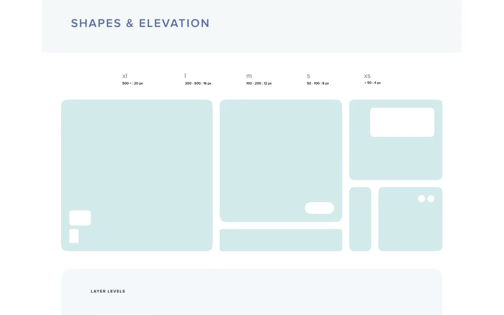
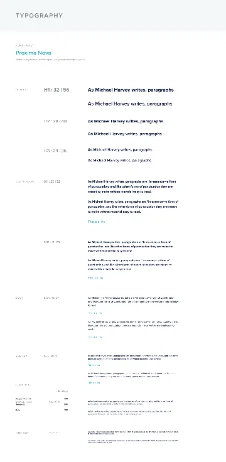
Using Figma, we listed every component on the platform in a table and organised them into atoms, molecules and organisms. Basics cover typography, colors, shapes and icons, the guidelines that make consistent components possible.
"We're not designing pages, we're designing systems of components.", Stephen Hay
Creating components
Every component was two things
01 · Intuitive
To keep the experience the same across platforms, components are platform-friendly. The table is built for desktop; on mobile, its equivalent is the card, same data, right ergonomics.
02 · Aesthetic
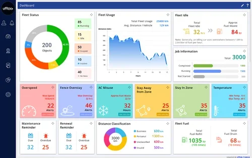
B2B doesn't mean ugly. By Jakob's Law, our users live in modern, clean apps elsewhere, we aimed for the best UI in fleet management: rounded corners, smooth shadows, minimal layouts. Here's the before → after.
Impact
What the system achieved 🔥
Faster design turnaround time
Faster development, thanks to a tokenized system
Higher component recognition across the product, consistent actions, inputs and content made it far more usable and appealing.
Established guidelines made building new components for unique features consistently swift and successful.
Marketing built their own library on top of it, extending the system's influence from product to brand.