Vehicle
Listing
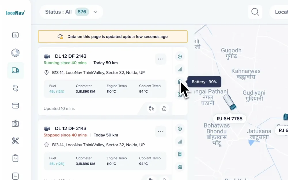
Redesigning the single screen where fleet managers spend 95% of their time, so a user with 5 vehicles and one with 5,000 both find the truck that needs them, fast.
Role
Senior UX Designer
Company
LocoNav
Scope
Whole module · 3 iterations
Platform
Web · Fleet ops
01, My responsibilities
I led the
whole module.
As the designer, I spearheaded the entire module, gathering requirements through competitive analysis, cold outreach and interviews with current clients, then collaborating with stakeholders to make the redesign future-proof.
02, The problem
Where users live -
and where they struggle.
Each client presents unique requirements for this one module.
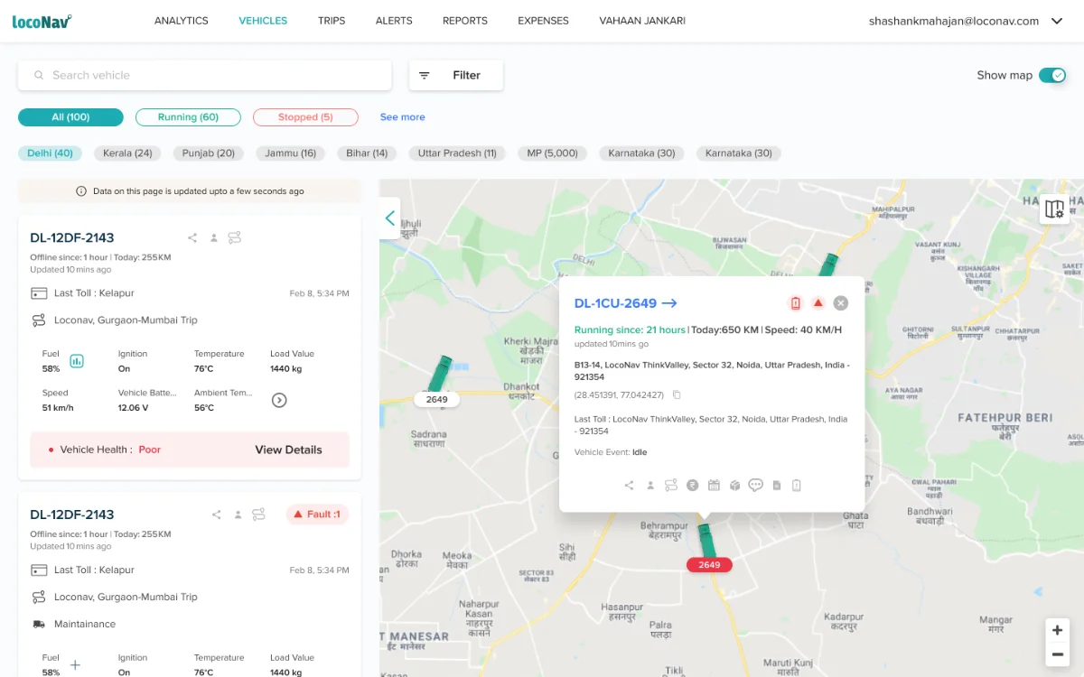
The page suffered from overcrowding and clutter, causing usability issues.
Users struggled to pinpoint which vehicle needed attention.
of a user's time is spent on this single tracking page.
Why this page matters
One page, every fleet size
Out of ~40,000 active users, the spread is enormous, and the same page has to serve all of them, across industries from F&B and cement to taxis, schools, transporters and mines.
manage fewer than 10 vehicles
oversee 10–100 vehicles
manage 100–1,000 vehicles
1,000+ vehicles, highest revenue
The goals: enhance efficiency so users act quickly, and improve the accessibility of features, for the smallest fleets and the biggest revenue drivers alike.
03, Research
How we found the problems
3–4 clients every week for 5–6 weeks, a structured regime with the user base split into groups by number of vehicles.
We observed clients' screens in depth to see exactly how they used the platform.
Which features got used, and which reports and alerts users cared about most.
Iteration 01, Filters
One collapsible row
We started with the essentials of fleet tracking, refining filters, which are crucial for pinpointing vehicles that need attention.
Our goal was to simplify by minimizing upfront filters, but many users still relied on them. So we consolidated everything into a single row, with the option to collapse it.
Iteration 02, Vehicle card
Strip it to the essentials
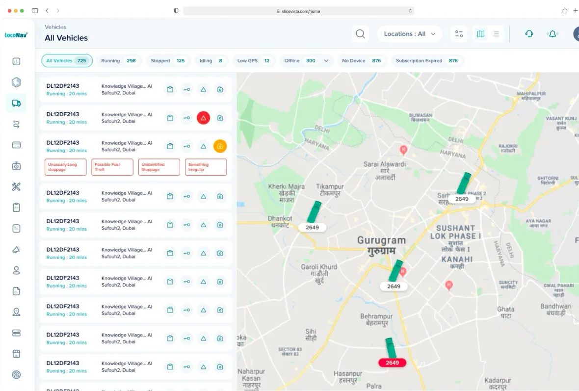
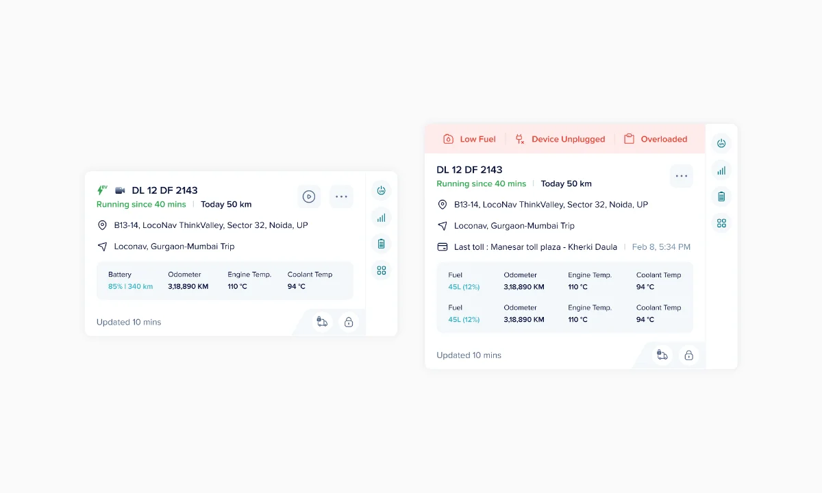
The second pass showed only the key elements: vehicle number, status (running / stopped / idling), current location, and activity updates.
But it didn't fit everyone
A fleet of 10 wants every vehicle upfront; a fleet of 100 wants an overview. One fixed card couldn't serve both.
Iteration 03, the breakthrough
The customisable card
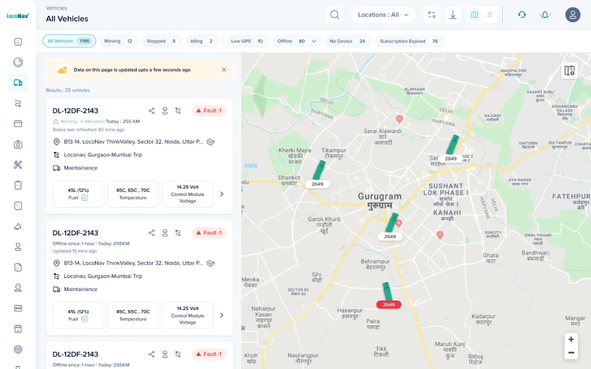
Instead of one card for everyone, we let users choose their own data points, up to 8 shown upfront, with sensible defaults (current location + status) that every fleet manager focuses on first.
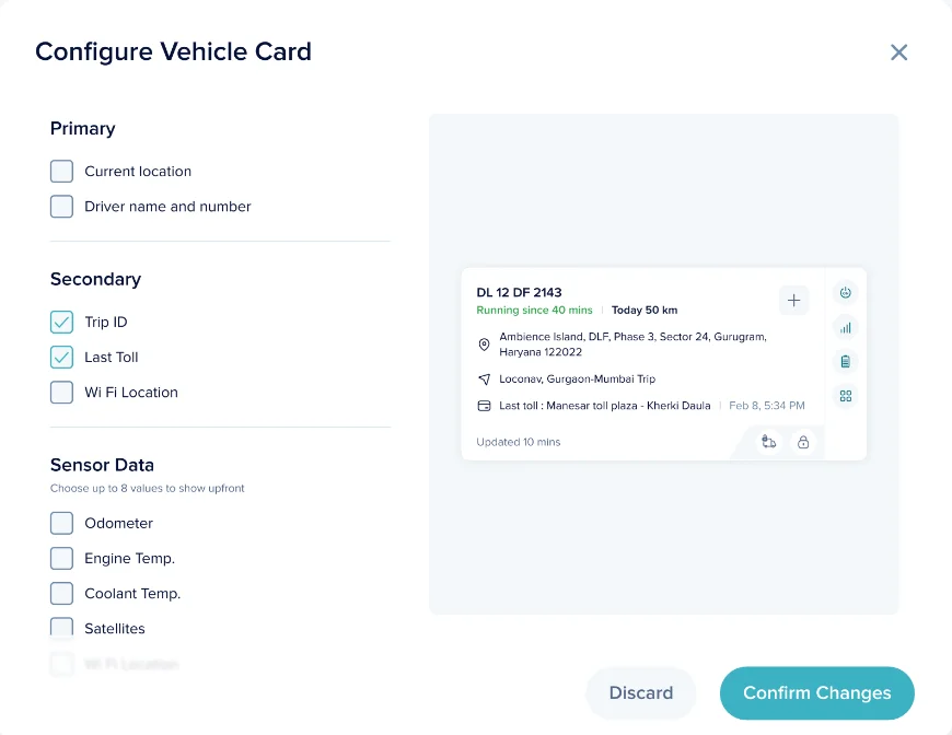
Defaults everyone needs
Pre-selected around the three questions every fleet manager asks first:
A business win, not just a UX one
Sales constantly received client requests for custom page tweaks, passing them to Product, who built client-specific versions, burning huge time. The customisable card let clients self-serve, freeing both teams.
Visuals, the map
A cleaner map, on brand
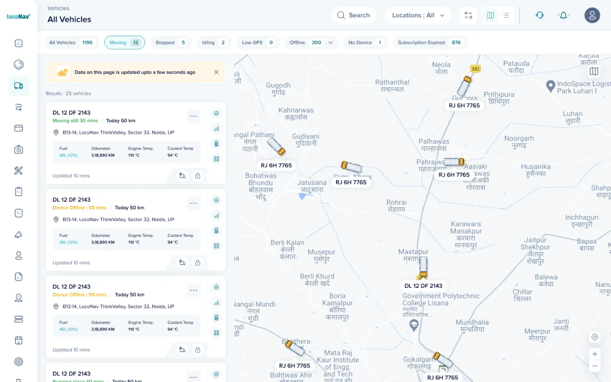
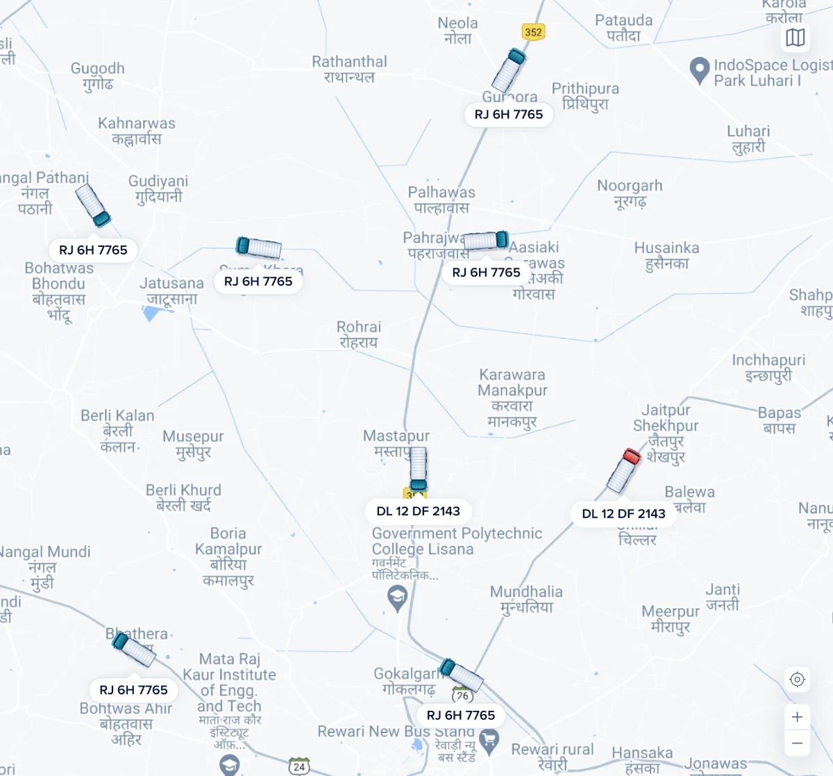
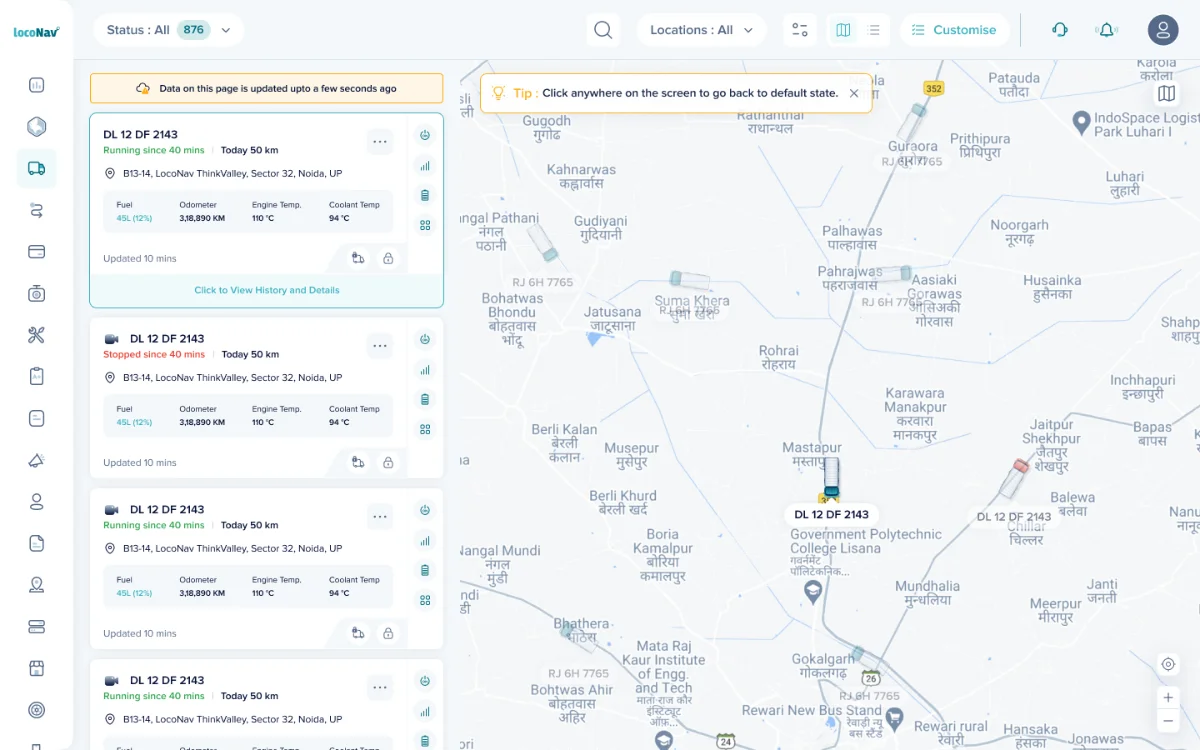
Once the structure was solid, we introduced a cleaner, less-cluttered map on LocoNav's color guidelines using Google's map customization, and gave it 60% of the screen, because users visualise the fleet far better on the map.
Google Maps pushed every bit of info onto the map; our layer on top made it overcrowded and hard to read.
The map's own colors dissolved our branding, the page never looked like ours.
Visuals, vehicle illustrations
Status you can scan
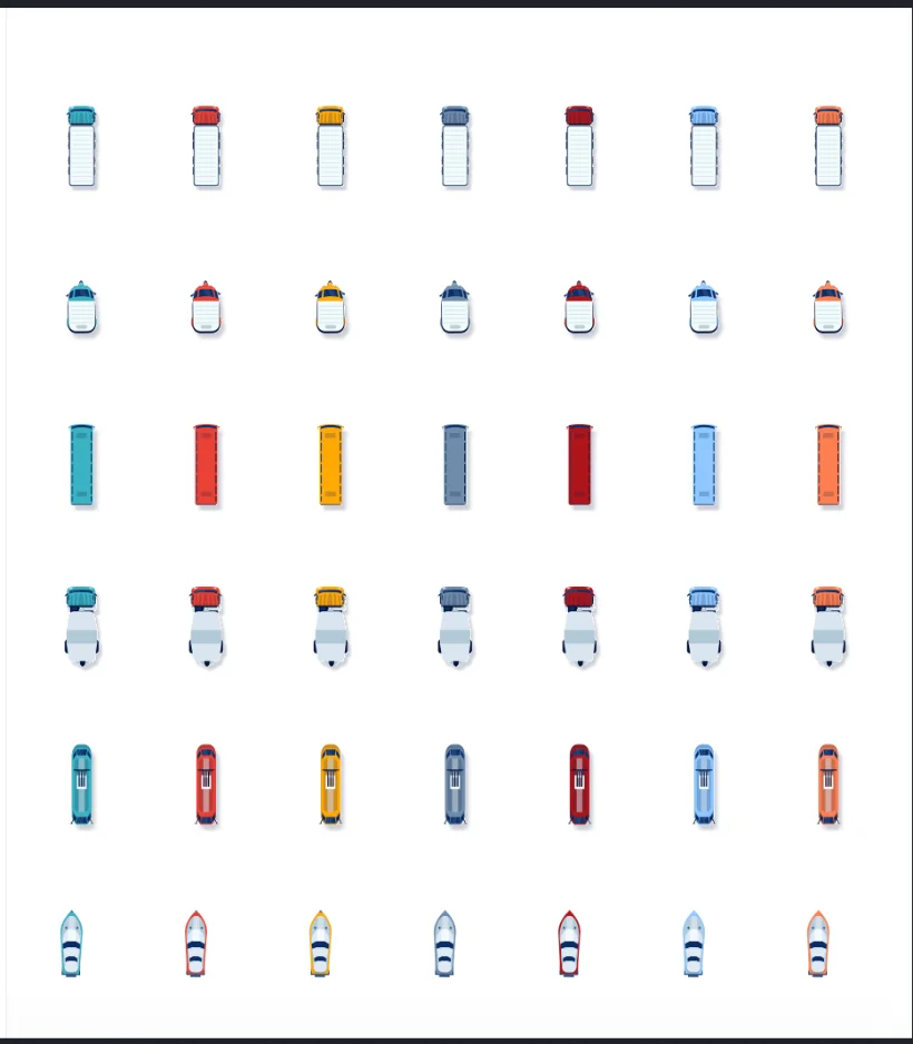
We replaced stock PNG illustrations with custom ones, and baked status indicators right into the vehicle art, so users (especially small fleets) can scan the state of every vehicle directly on the map.
And it isn't only trucks, we can track humans too.
Design in use
From a glance to a deep dive
Select a vehicle and the map centers on it, letting the user investigate further and pinpoint the problem, right down to add-on devices like immobilizers and e-locks, sensor data, network strength and fuel.
Prototype
See it in motion
Impact
What did we achieve?
"This fleet-management software has the best user experience."
Hard-coded custom builds, the customisable card cut user requests and sales conversion time.
Filter usage, sessions using 1–2 filters rose from 60% to 80–85% (Google Analytics funnel).
A rise in LocoNav adoption across the Middle East, Africa and Europe.